
West
Year
2014 — 2021
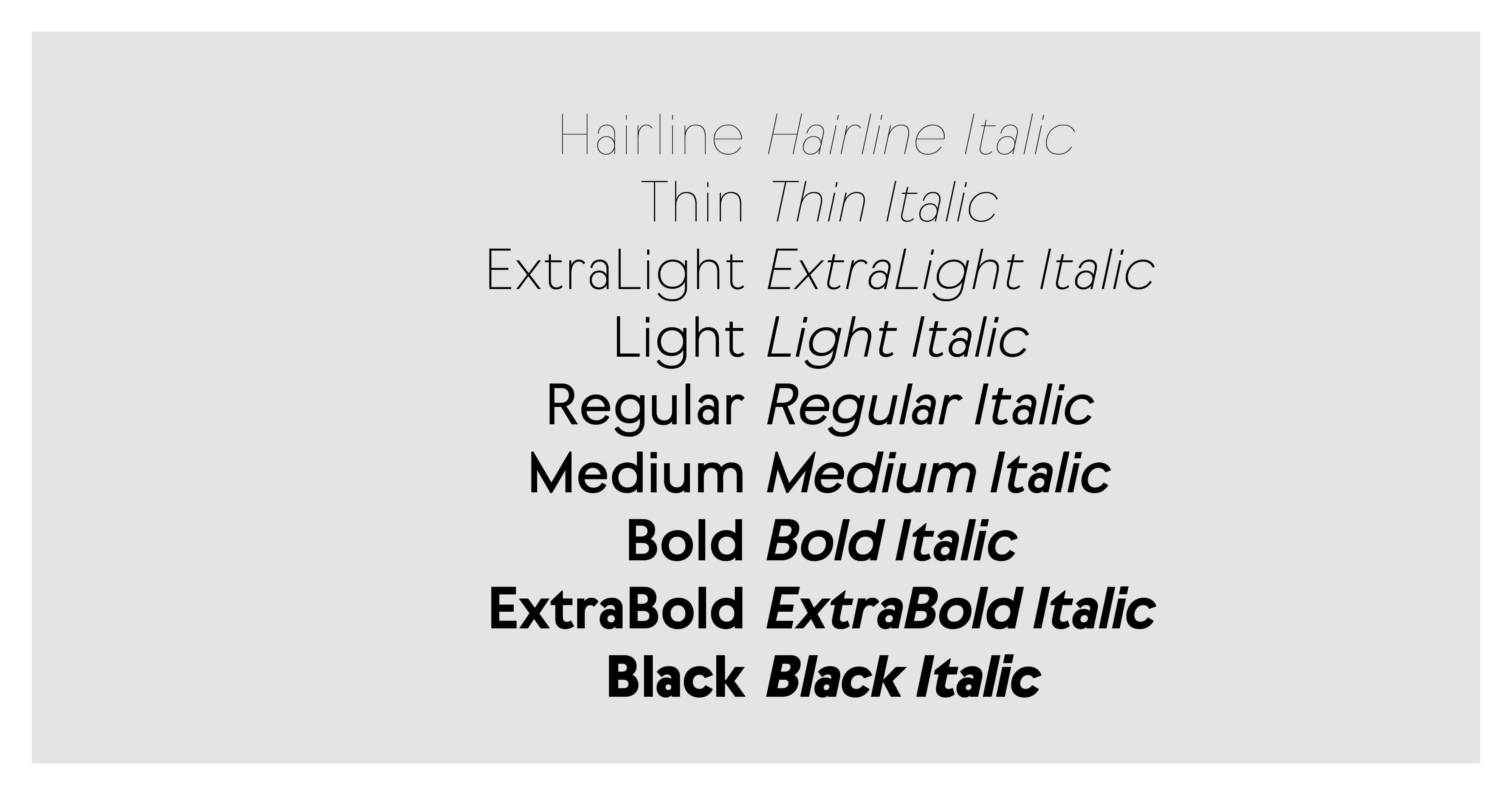
Styles
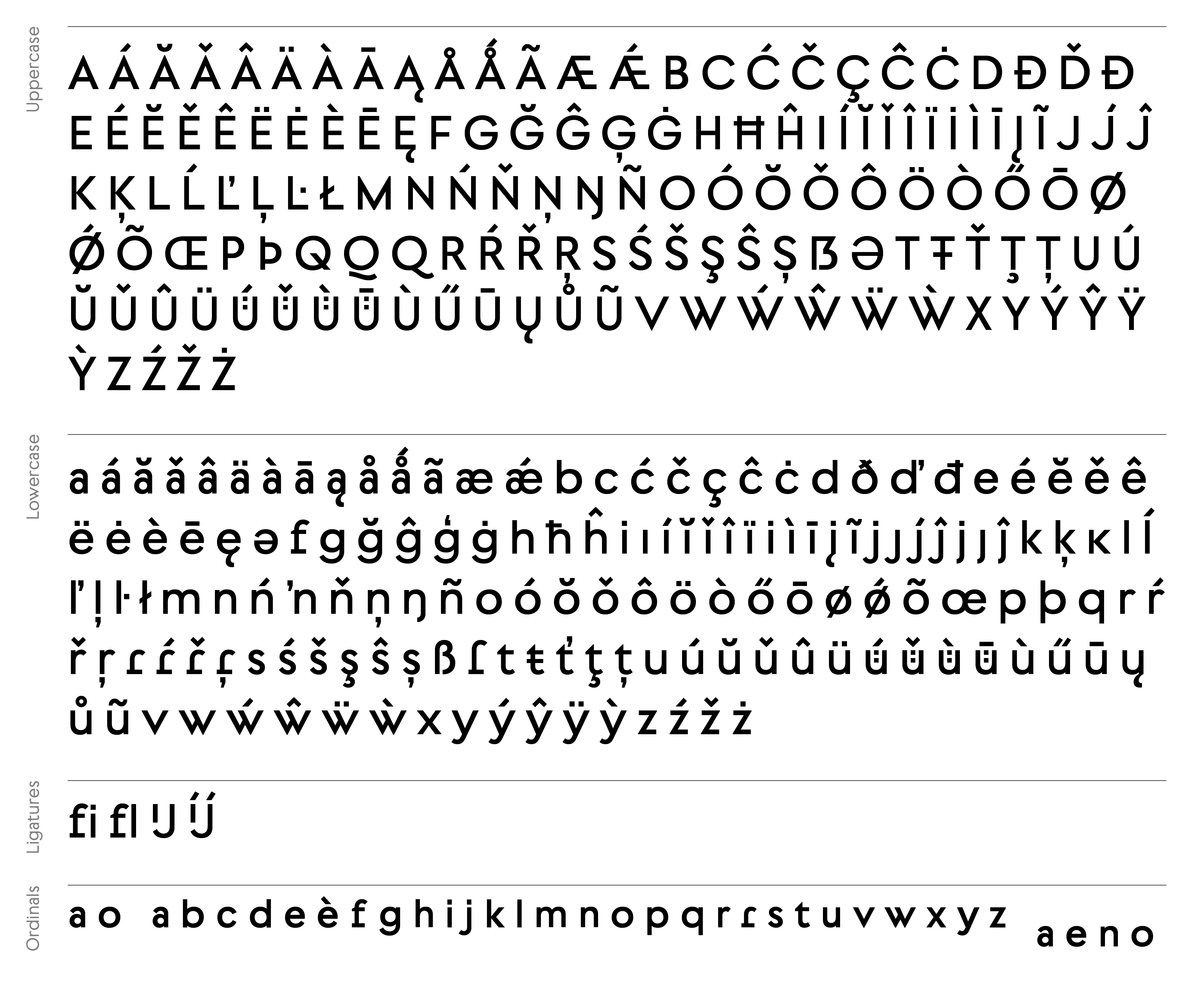
18 + 2 OTVar fonts
№ of Glyphs
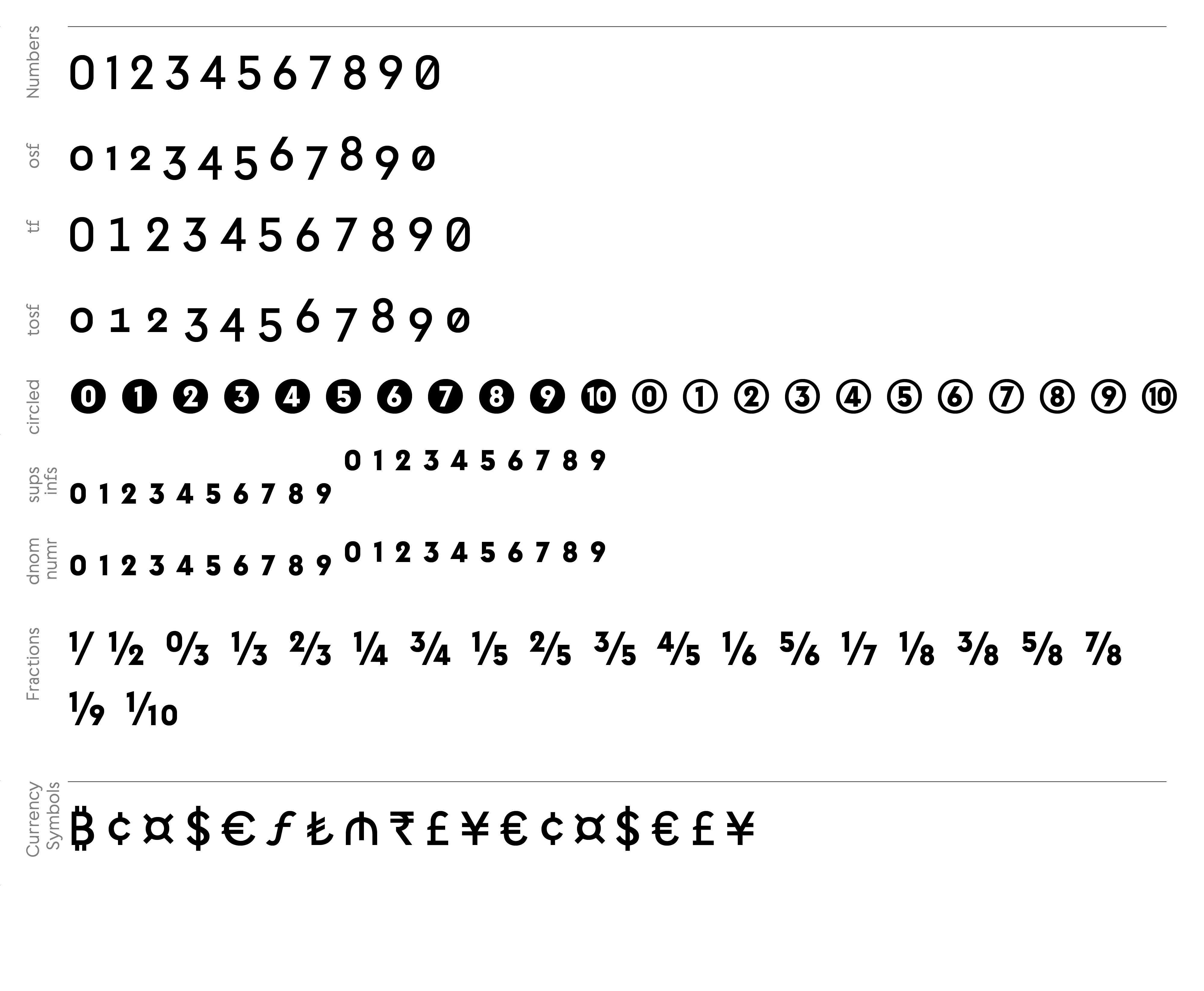
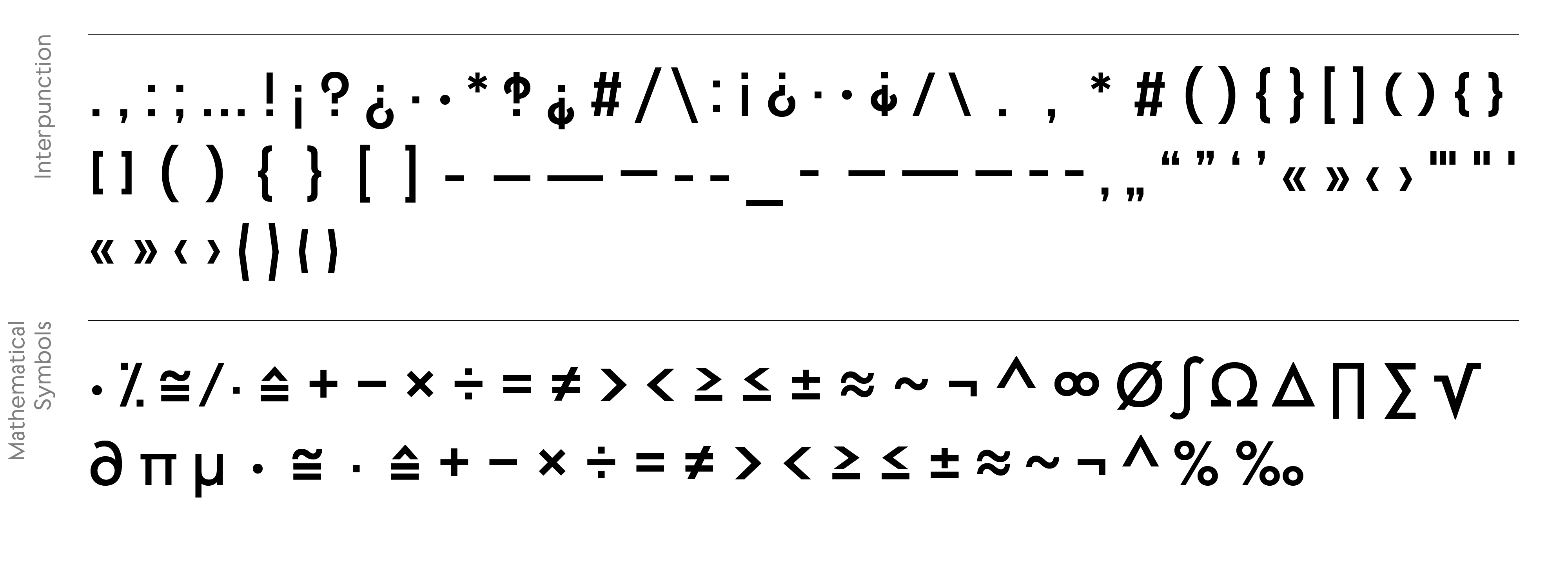
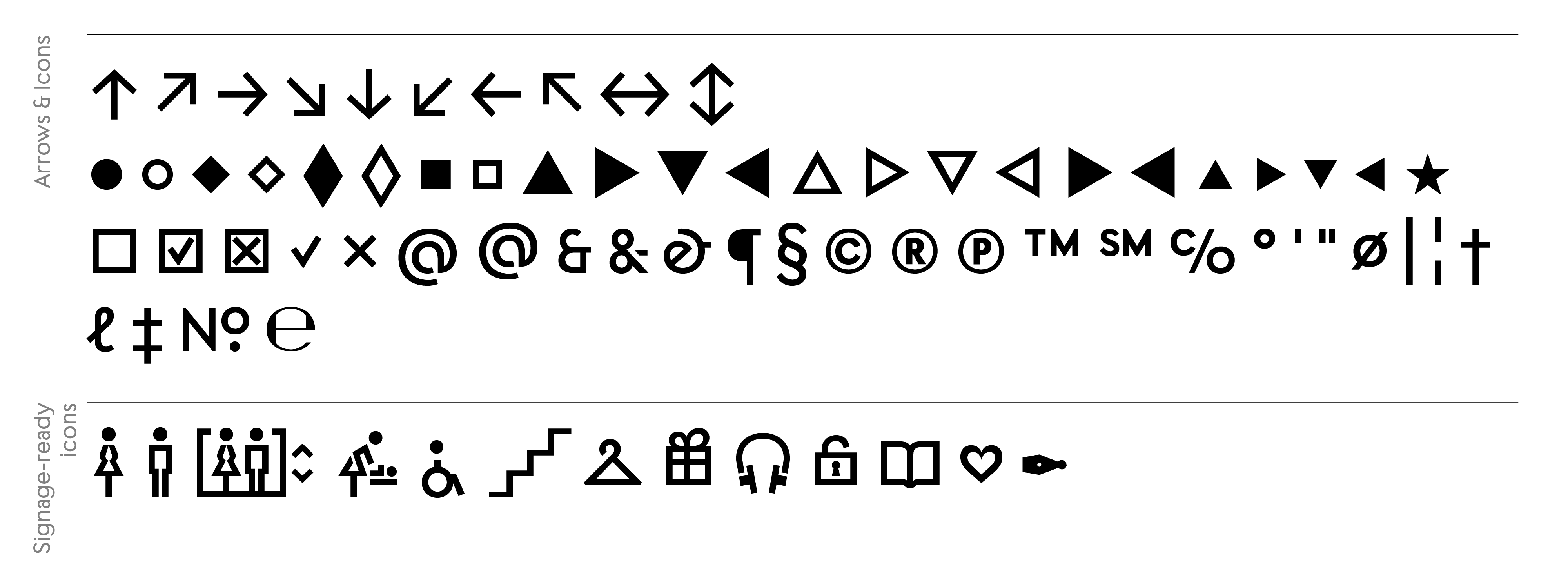
754
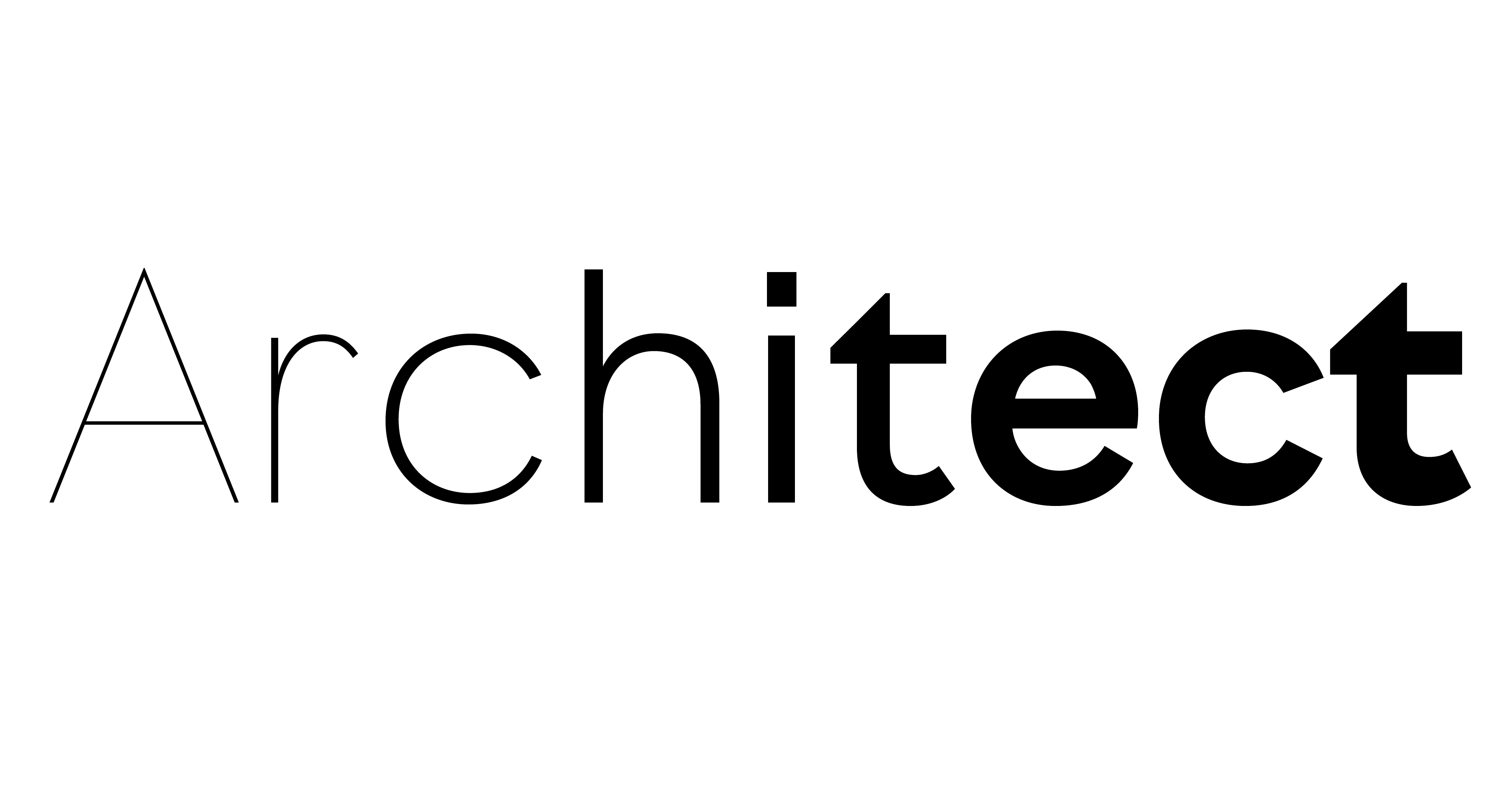
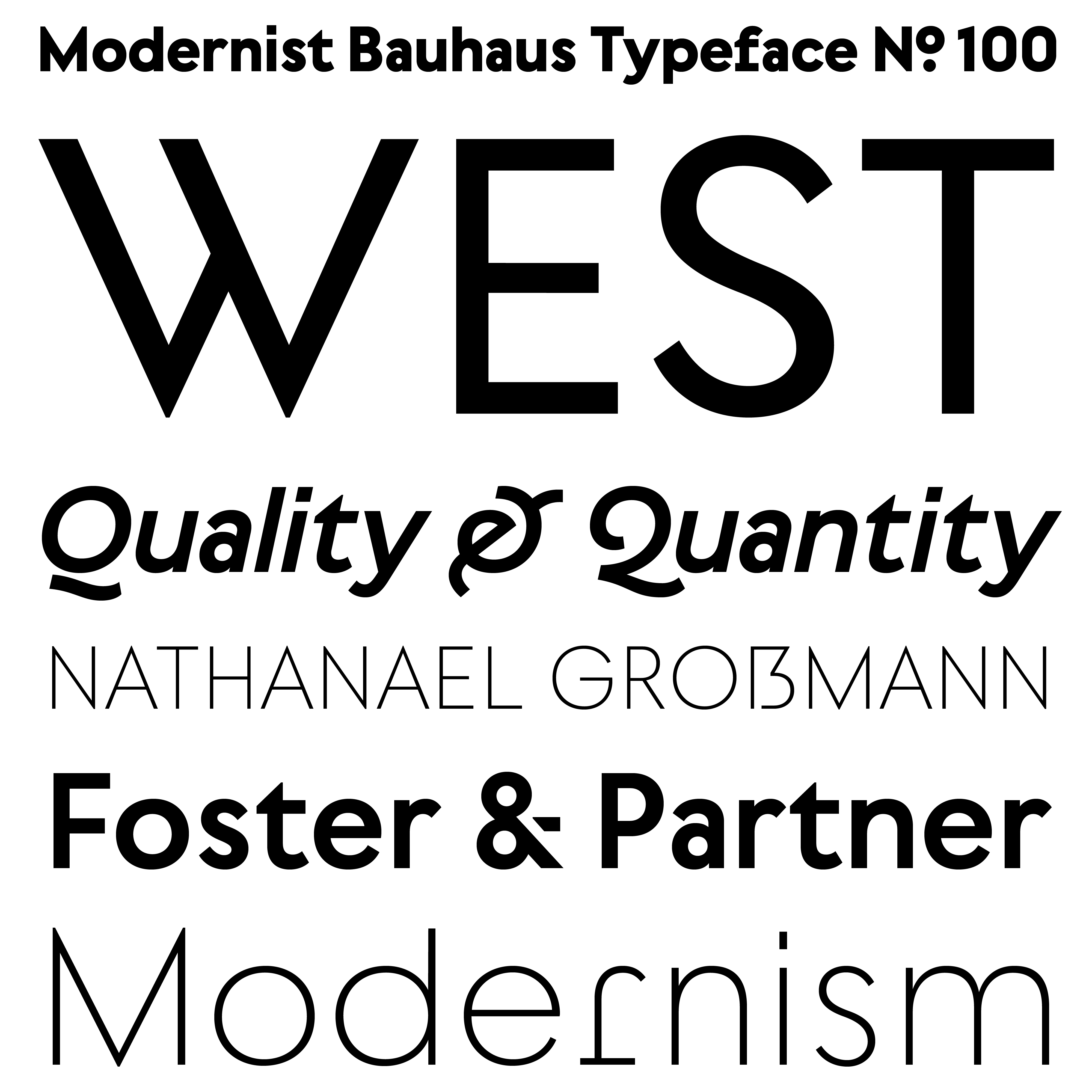
Squares, circles and triangles often fascinate creatives, not least those who design typefaces. It’s therefore hardly surprising that many fonts that are rooted in these classical forms look rather similar. West follows in this very geometric tradition, but achieves independence and its own distinct character with a simple formula: visually similar forms do not repeat. Combining conciseness and pragmatism, it presents itself as timelessly modern but has its roots firmly planted in the practicality and functionality of classical modernism.
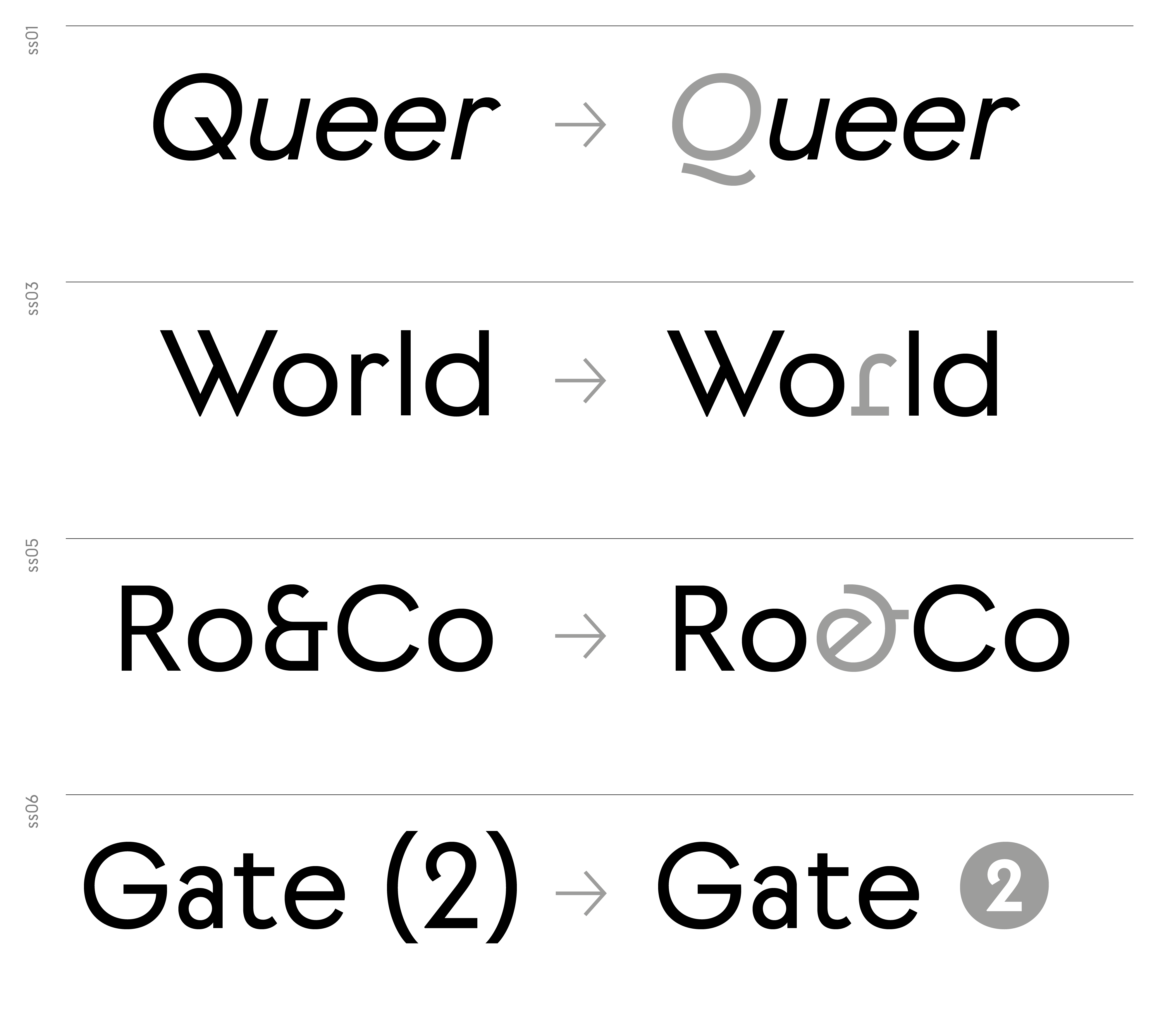
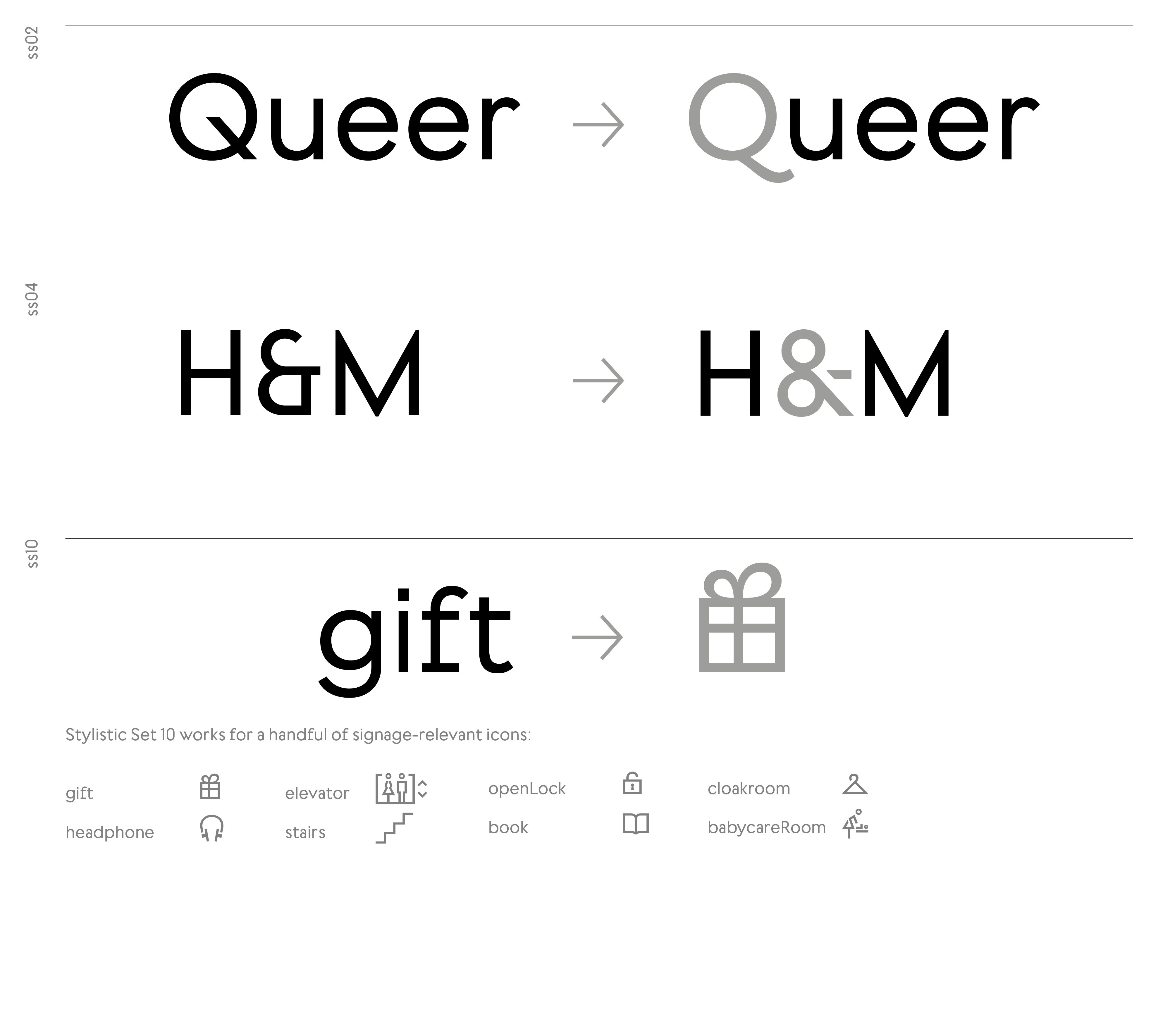
West reinterprets the concept of geometric sans serifs in an original way. In order to maintain a harmonious canon of shapes individual letters vary in their widths (e.g. a narrow a & s vs. a wide b, n & J). This unique character is further emphasized with unusual glyphs such as W, t, f, 2, etc. West’s character beautifully oscillates between Art Deco influences, more technoid influences of the nineties and fully reduced geometric grotesques. All together, these design idiosyncrasies result in a compelling, contemporary mix.
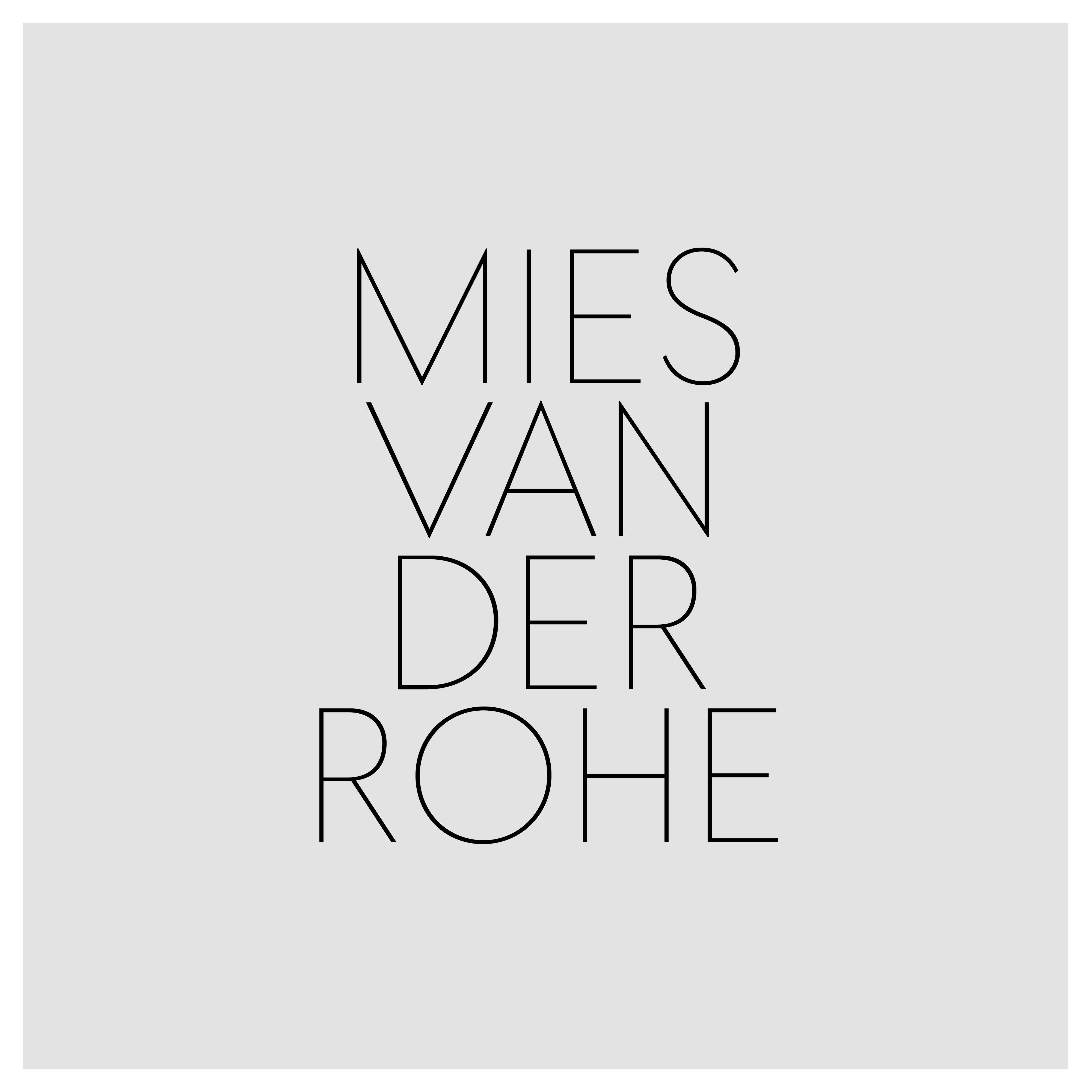
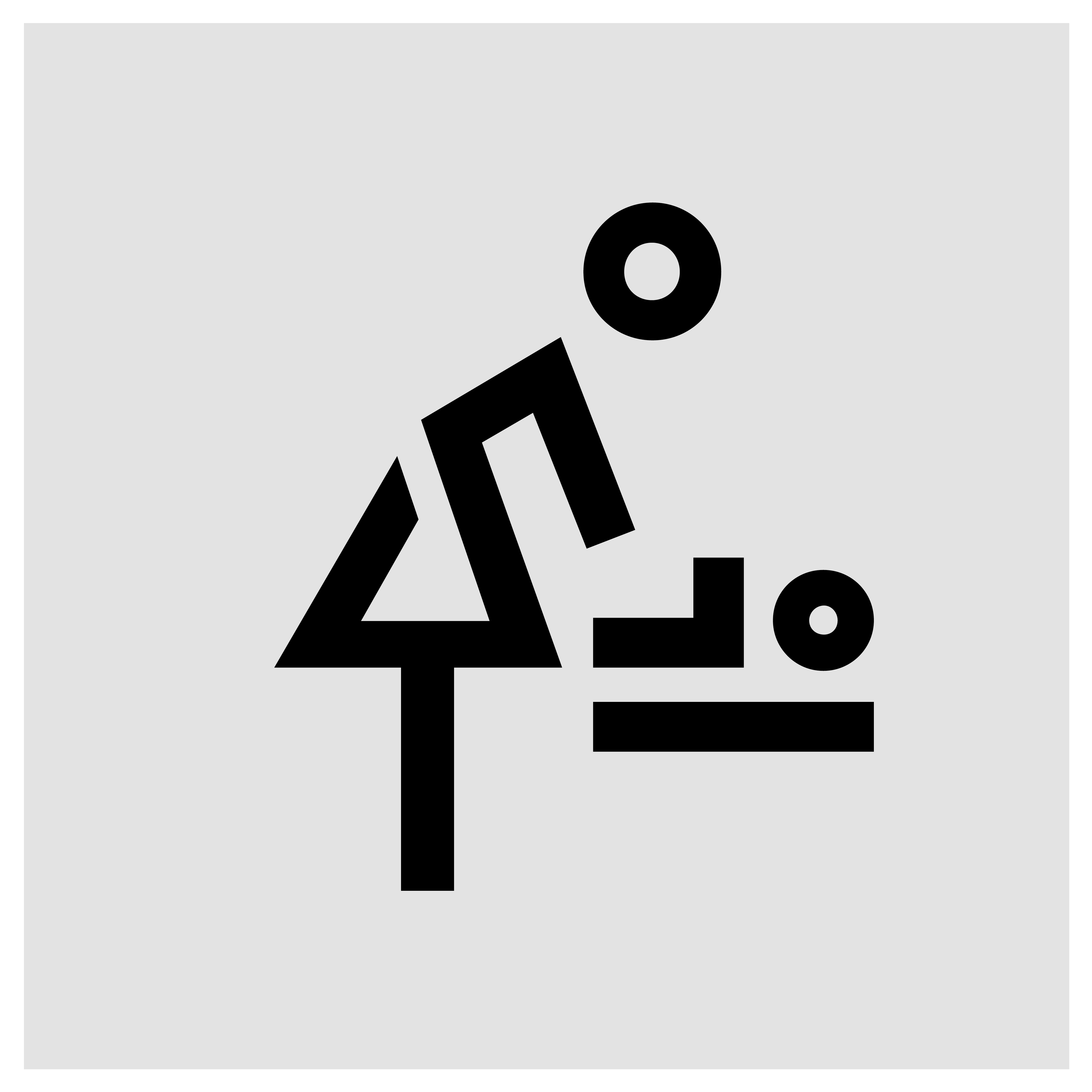
West is recommended not only for display use but also for smaller text or for wayfinding or signage systems. This has already been put into practice for the wayfinding system in the Old Masters Gallery in Dresden, where individual icons were designed, which were then adopted into the present fonts and adapted to the respective stroke width.


Say Hi!
Wanna say hi or enquire about individual pre-release licenses?
Contact
info@bureau-perraudin.com
+49 176 / 27 21 57 12
@danielperraudin
Berlin, Germany
Copyright
© Daniel Perraudin, 2023
All rights reserved
