Golt
Year
2019 — 2022
Styles
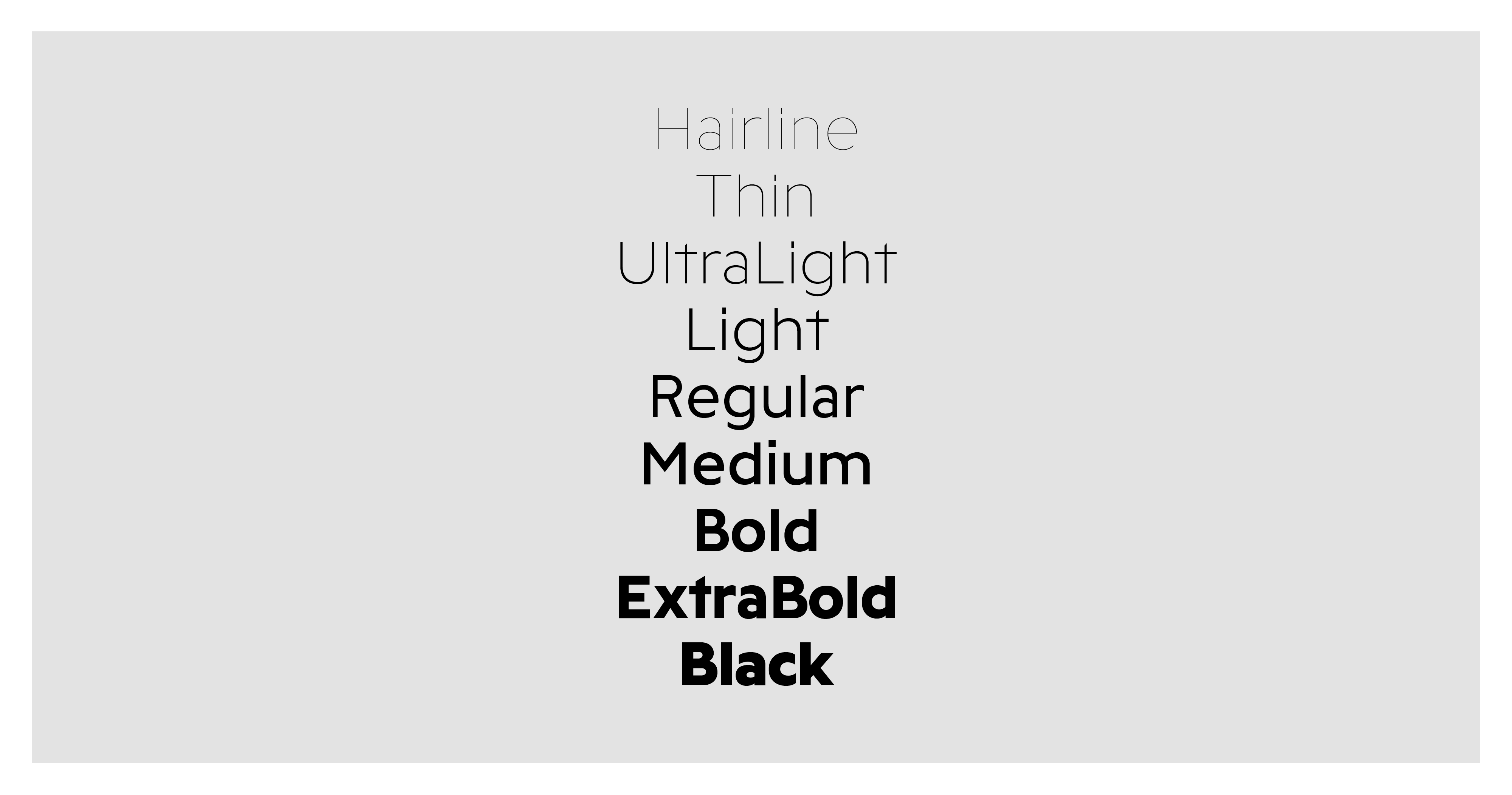
9 (currently only Romans)
№ of Glyphs
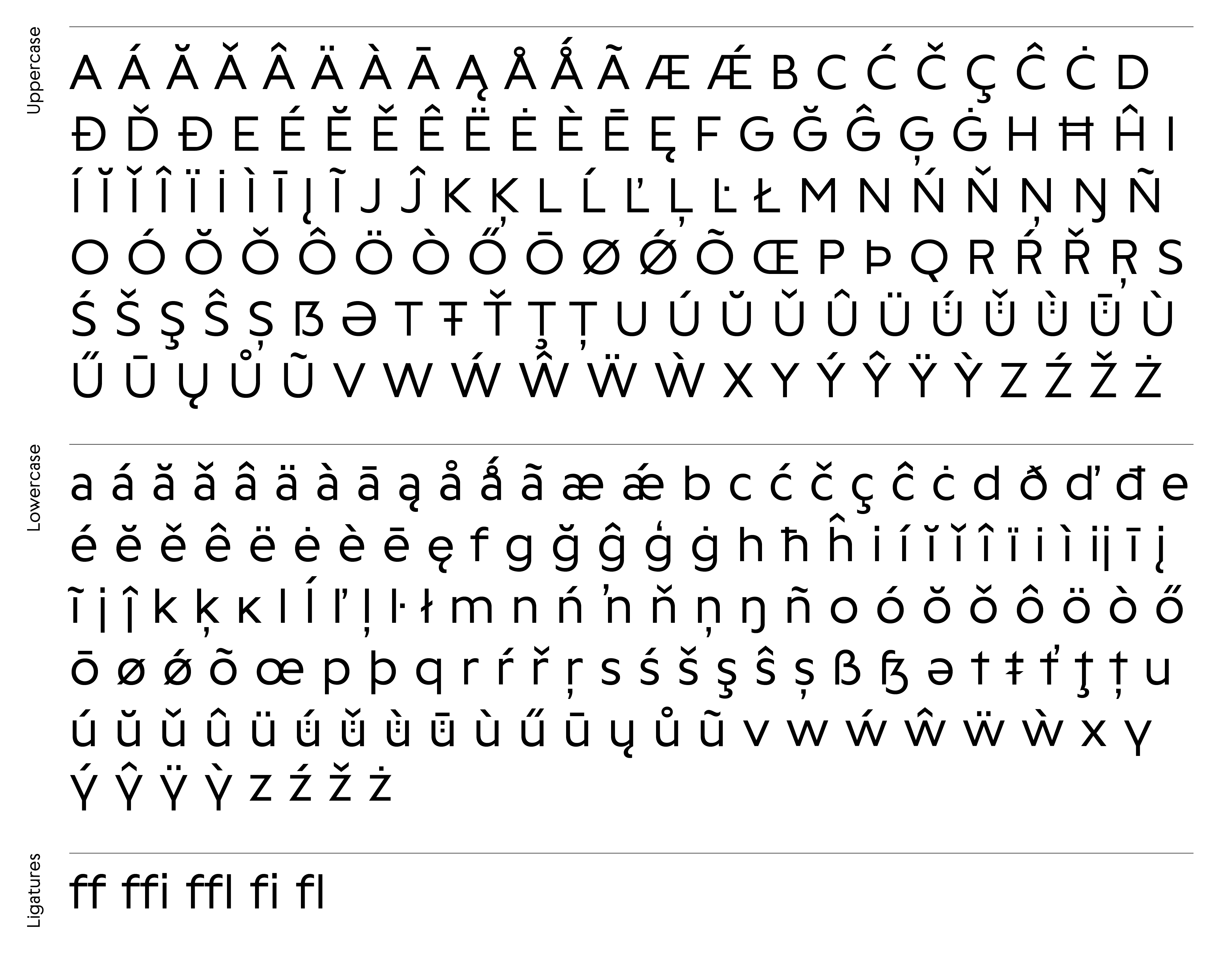
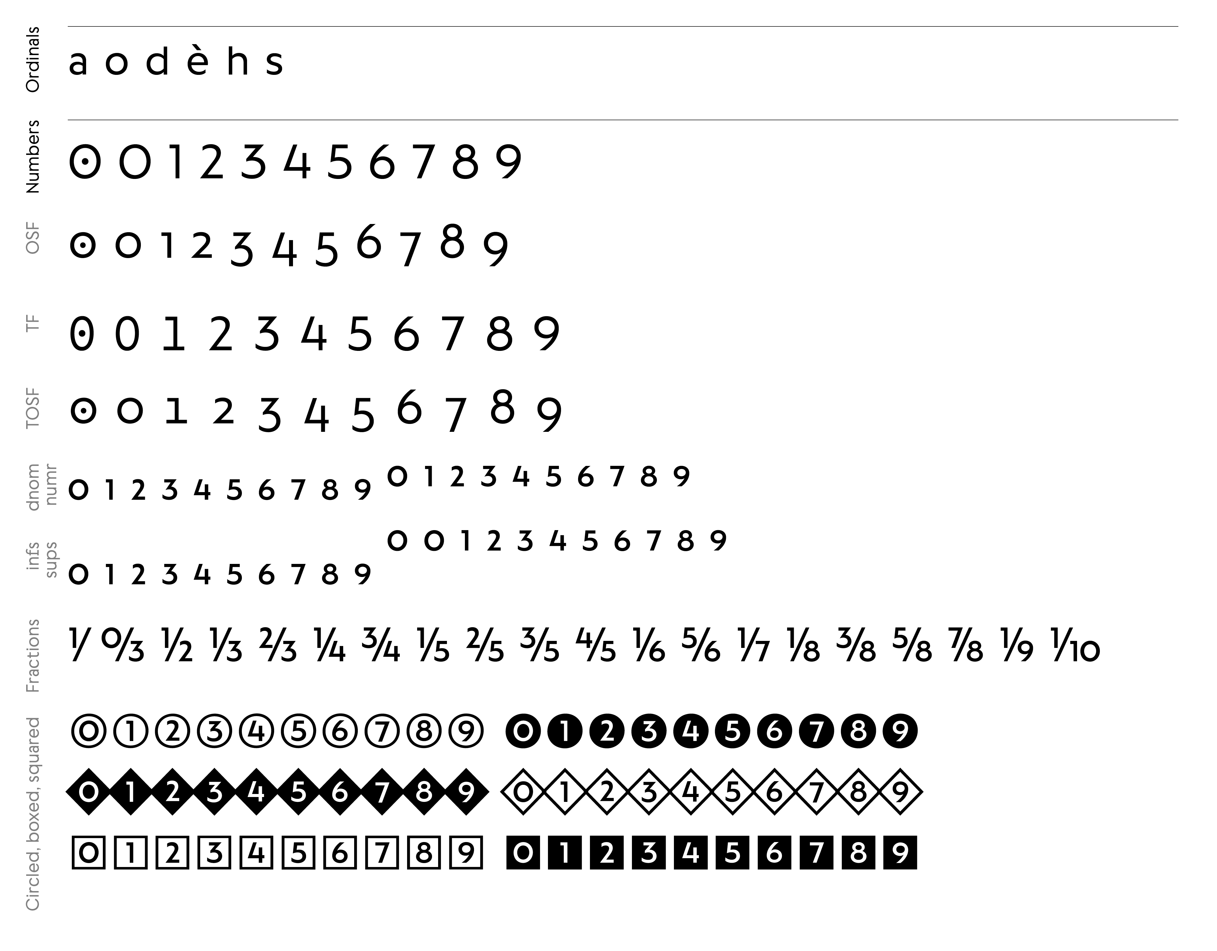
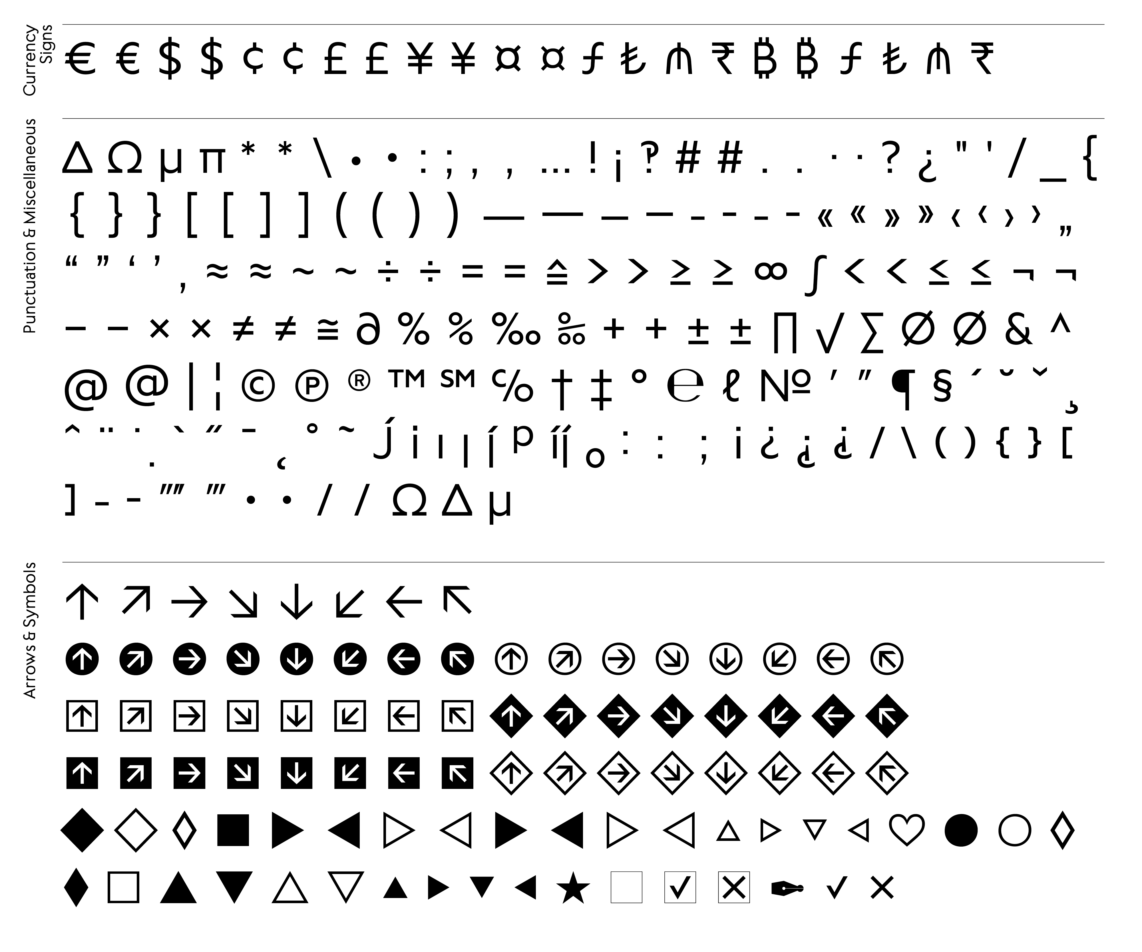
751
Additional credits
Alexander Roth (neue Foundry)
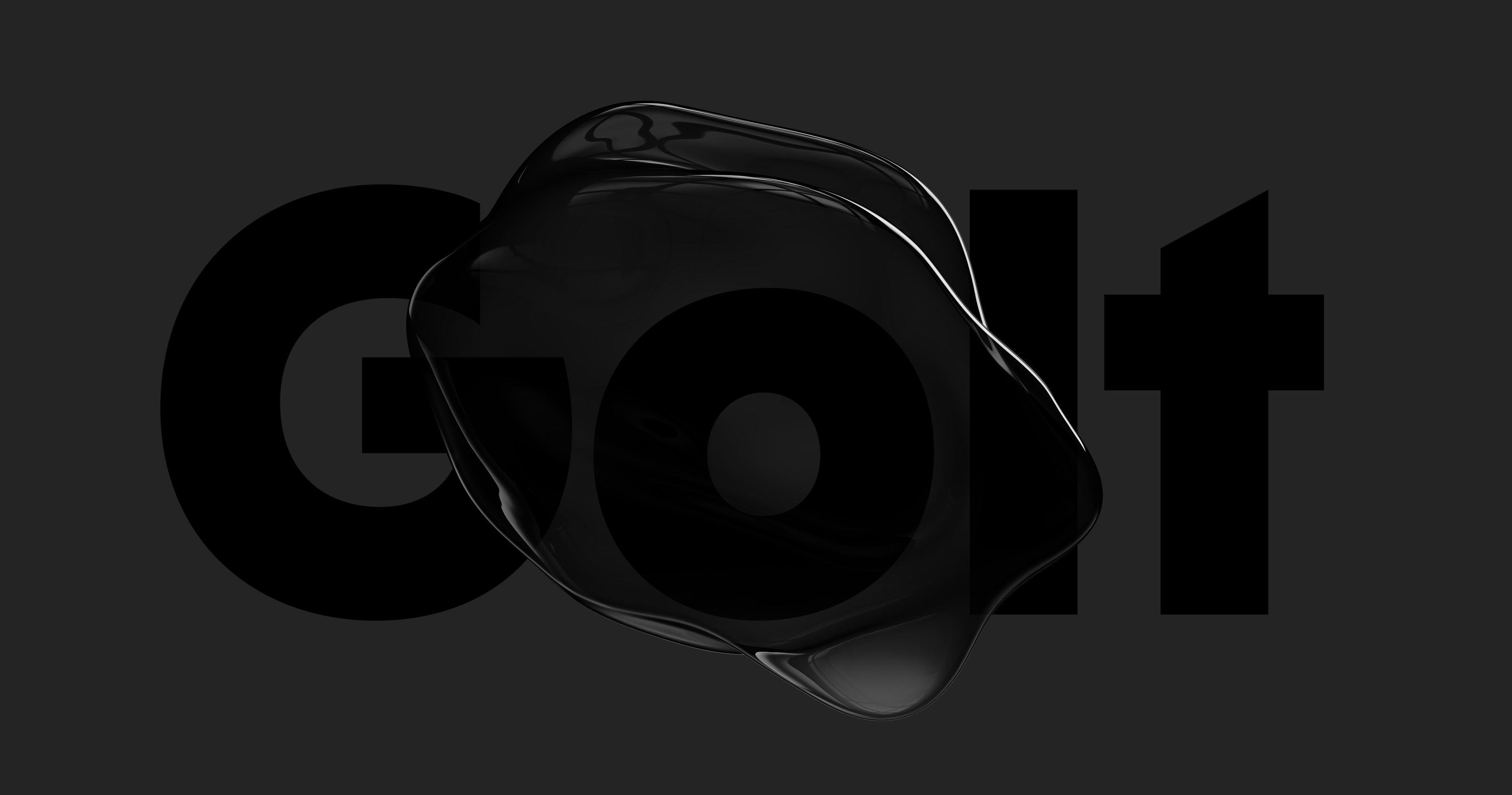
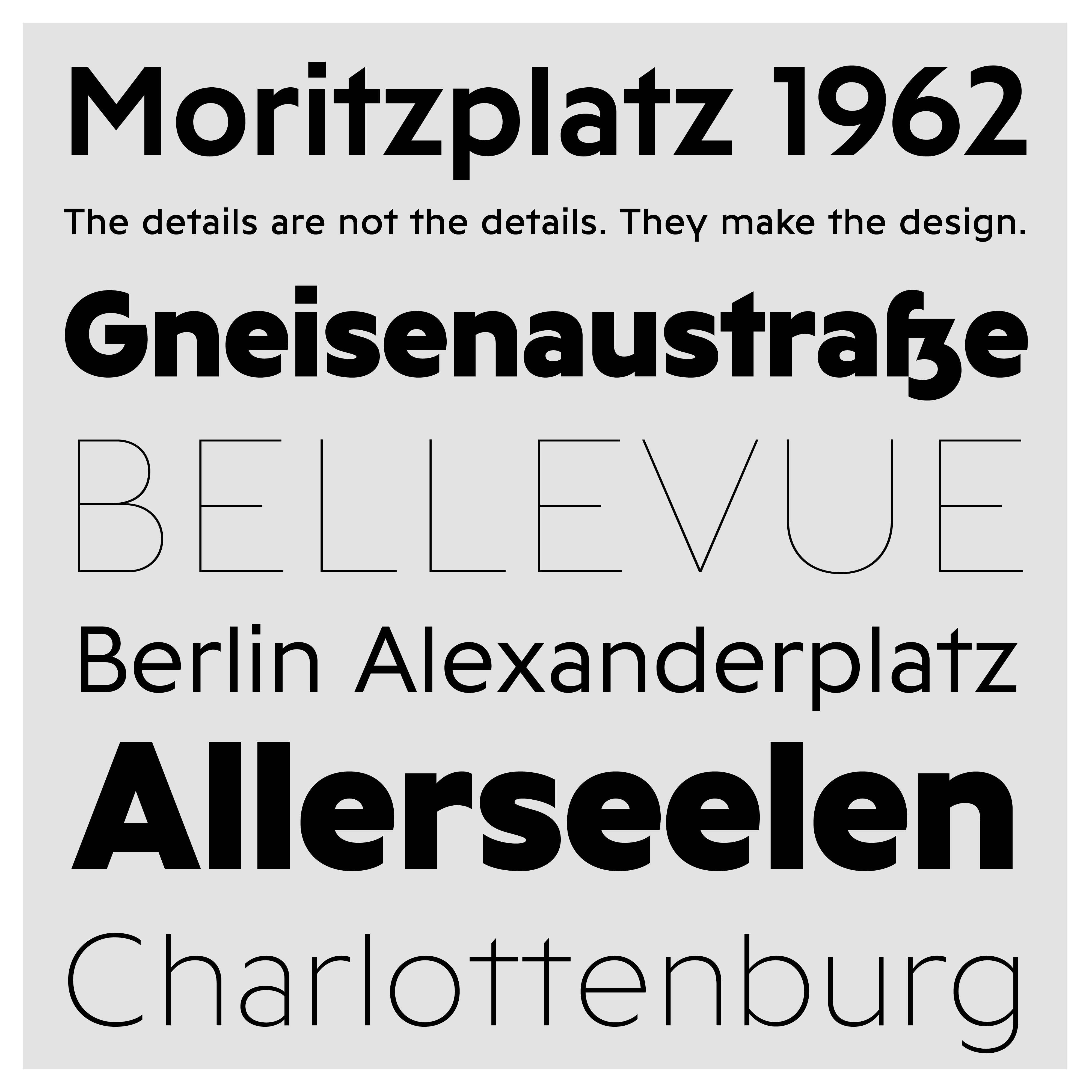
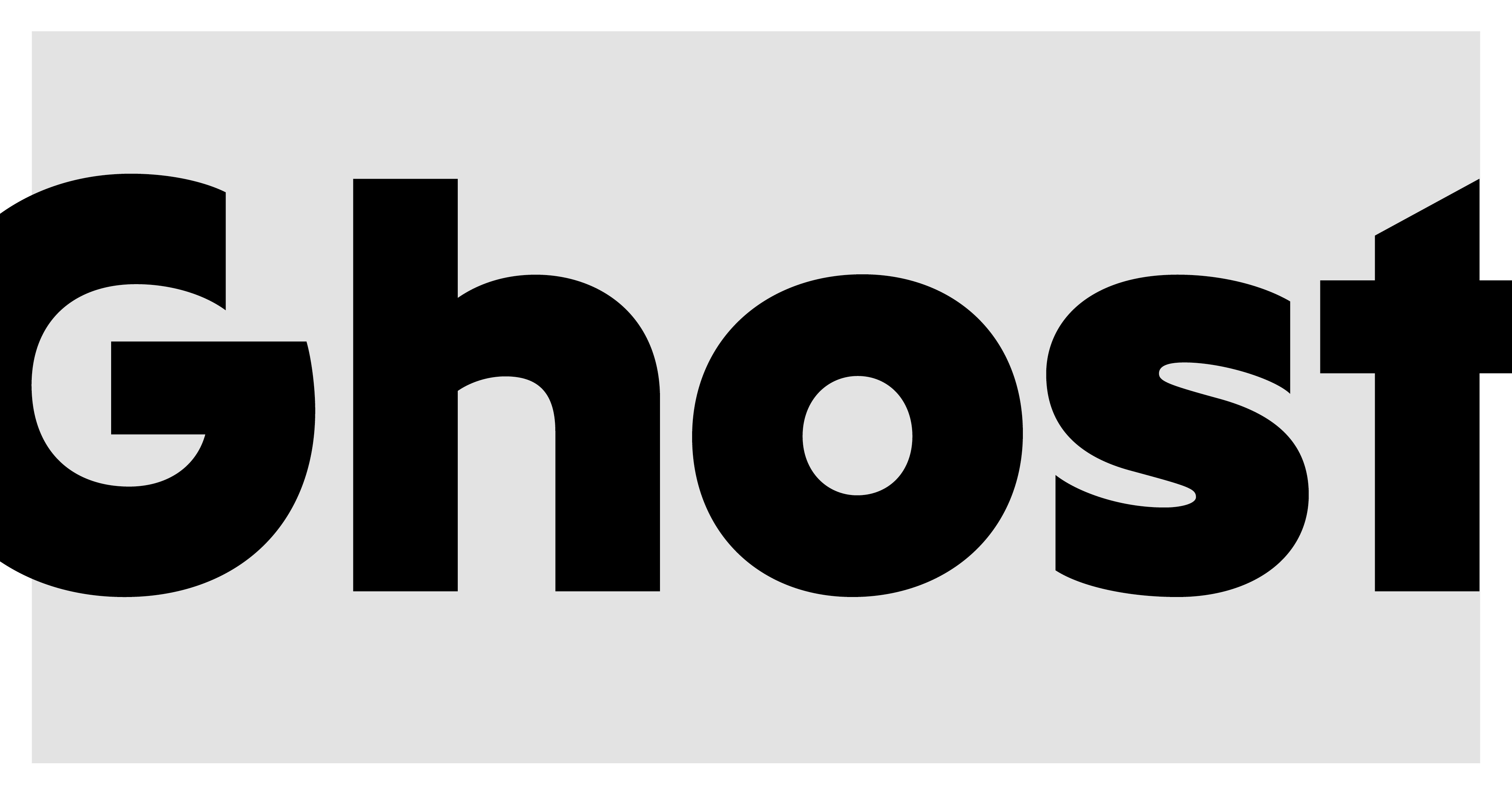
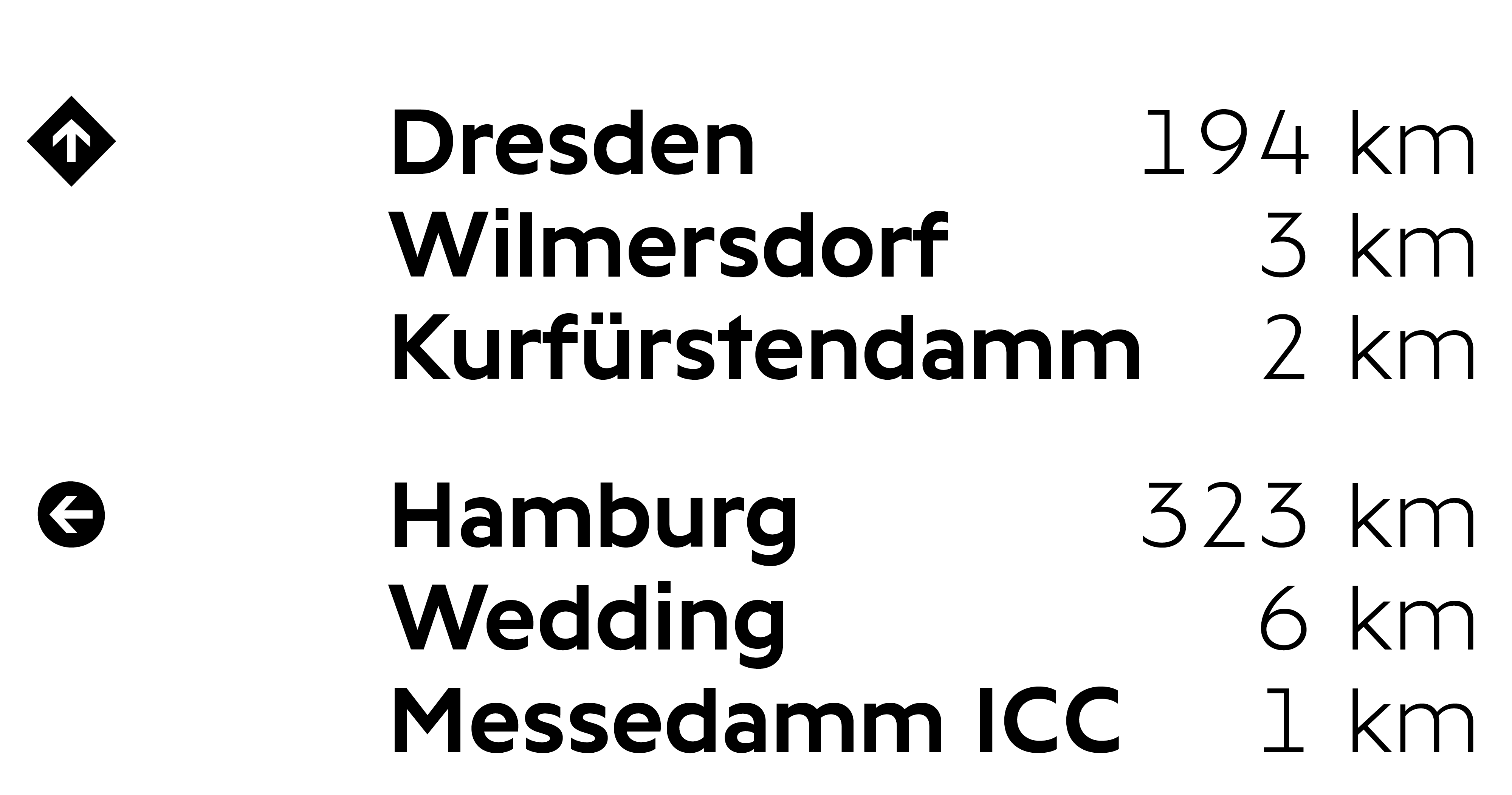
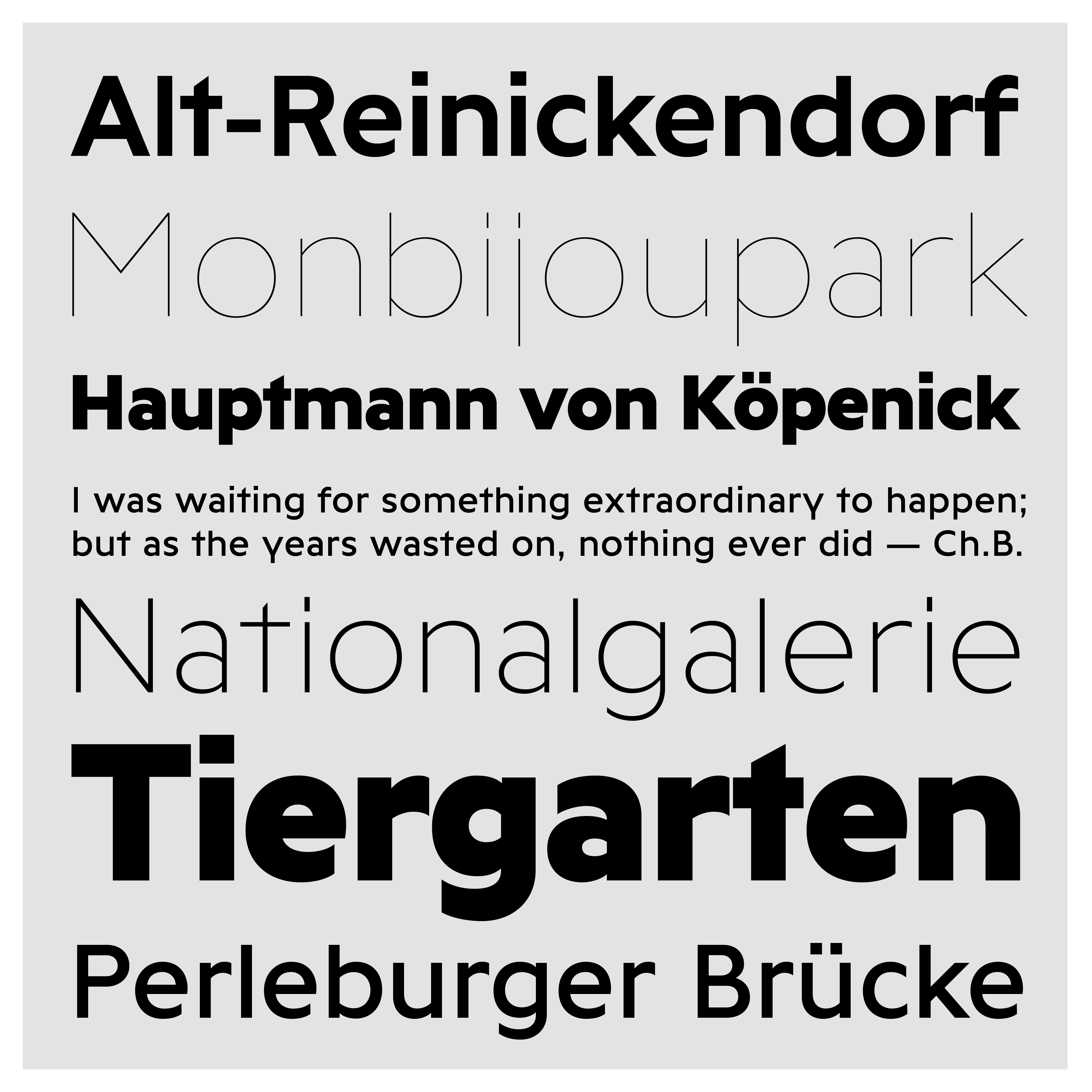
Golt is an urban typeface of expressive neutrality. It is inspired by and loosely based on types that can be found on the streets and metro signs around the city of Berlin, where decades of sans serif type history collide.
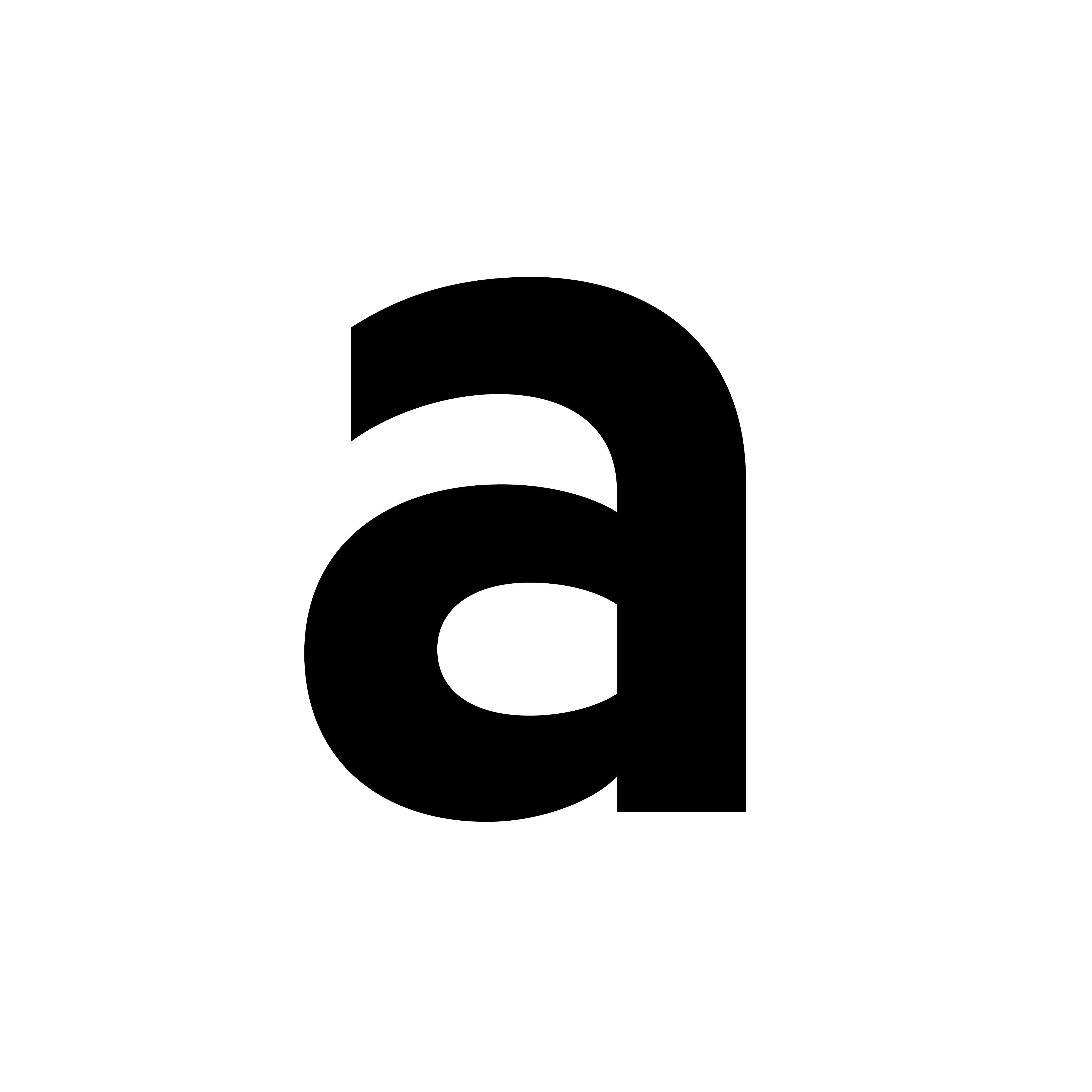
Golt’s design is neutral, but contemporary and sometimes sturdy. The underlying skeleton of the letters is rather wide and rounded, whereas the vertical stroke endings make for a sharp appearance on screen and printed. Letters such as the distinct G, y or the diagonally cut t define Golt’s character. Some letters drawing clear reference to Berlins street signs designed by Andreas Frohloff in the 1990’s like the contextual alternate of the German “eszett” (ß).
Golt is the perfect fit for a briefing like: “I don’t want another Sans that’s just quirky for no reason, nor another neutral Sans that looks like all the others. Give me something contemporary. Give me something special.”


Say Hi!
Wanna say hi or enquire about individual pre-release licenses?
Contact
info@bureau-perraudin.com
+49 176 / 27 21 57 12
@danielperraudin
Berlin, Germany
Copyright
© Daniel Perraudin, 2023
All rights reserved

